

Creating Graphs
All regular tables on the site, as well as custom tables, can be plotted into a graph, but the most appropriate candidates for plotting are tables formatted with years as the left-most column.
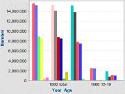
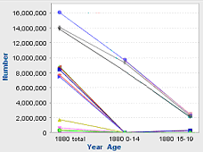
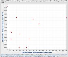
The following graph types are offered:
You can plot several series in one graph, or plot each series’ values (i.e., each bar or line of a graph) into separate graphs.
To create a graph:
Go to a table and click Graph at the top of the table, or select Graph from the Actions drop-down list in the left pane.
Select the type of graph that you want to plot (bar, line, or scatter graph).
Select Series: By default, all the Series (i.e., typically columns of a table) are selected for graphing. (To deselect series, tick the box next to Deselect All Series, or untick the series you don’t want to graph.)
Enter the Specific Rows you want to graph, if desired.
Note: By default, the graph is plotted for all the rows of the table.
Click CONTINUE. The Edit Series Titles section displays in the left pane; other graphing settings display in the right pane. Edit the series titles, if desired.
Enter the Graph Title. (By default, the title of the table appears in this field.)
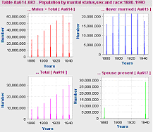
Set the Mini-graphs option to Yes to view each series in its own small graph. (This option is not applicable for scatter graph.)
Select the number of rows you want to be graphed per web page, and edit the axis, scale, interval and axis labels (if desired) and click Graph Data. The corresponding graph is displayed in a new window.
Note: If your browser is set to block pop-up windows, you may need to either turn the pop-up blocker off, choose to temporarily allow pop-ups, or add http://hsus.cambridge.org to the list of "Allowed Sites" in order to see your graph..
You can also perform the following functions:
To print the graph, click Printer-Friendly. Depending on your browser, you may then see printing options automatically, or you may have to manually select 'Print' from your browser's File menu.
To download the graph, click Download.
To see the data in table form again, go back to the graphing options window and click ‘Show Table View’ near the top right of the page. The pop-up window containing your graph will remain open unless you close it.